Ksenia Titova

it’s important because can affect the readability and accessibility of the content for different users, including those with visual impairments. By ensuring sufficient contrast between text and background, designers can make the content more legible and easier to understand for all users.

Checked all the colors to contrast between different colour combinations against WCAG 2.1 standards. Compared of the contrast the foreground and background of the elements that are in the page according of the Web Content Accessibility Guidelines (WCAG). 

Contrast is calculated using “relative luminance”, which is defined as: The relative brightness of any point in a colorspace, normalized to 0 for darkest black and 1 for lightest white. The relative luminance can be calculated from any colour code (like HEX or RGB). 

Checked all the color to contrast between the foreground and background of the elements that are in the page according to the WCAG 2.1.

Scan Website Pages

Select from different WCAG rulesets to scan your site against. Choose from WCAG 2.0 A, WCAG 2.0 AA, WCAG 2.1 A, WCAG 2.1 AA, or best practice, and analyze your results. You can highlight their location on the page, expand details, and view their severity.

Start Scanning for Free ->

Check Contrast Ratios

Select the foreground and background color of any elements on the page to check their contrast ratio and WCAG conformance.

Check Contrast for Free ->

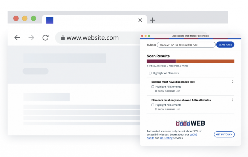
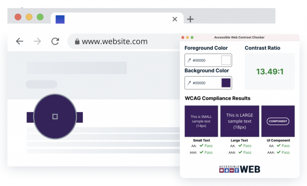
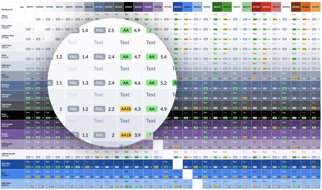
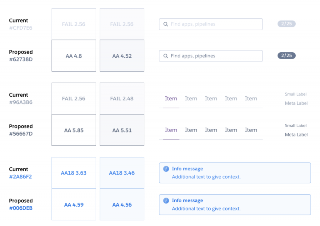
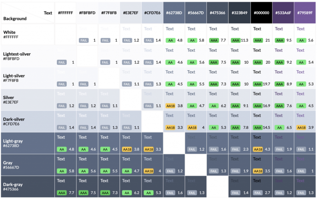
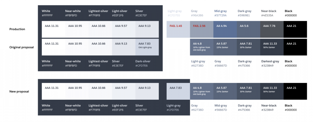
Color selection is crucial in design systems as it represents brand identity, theme, feedback, and interactive affordances. To ensure that color combinations for a particular design are well-balanced and comply with color accessibility standards, use EightShapes Contrast Grid. This tool offers comprehensive features to assess and adjust your design’s contrast color for text, border, background, and interactive state.

The features of Contrast Grid are quite clear and easy to use. All you have to do is input the colors’ names or HEX values into the Rows and Columns box on the left side of the tool. You can choose to use the same values for both background (rows) and text (columns), or use distinct options by entering the values separately on each box.

One thing to note when entering the HEX values is that you have to enter only one color per line. Alternatively, you can input optional color labels in addition to their values by separating them with a comma.

As soon as your input is done, your choice of colors will be automatically displayed on the grid. You can see different combinations of text and background colors along with their WCAG accessibility grades and contrast ratio.

Do pay attention to the highlighted grades. Most of the time, the grid will show the following grades:

  • AA and AAA Grade in gray highlight, meaning that the color combination meets the WCAG standard of minimum contrast with a ratio ranging between 4.5:1 and 7:1. You can safely use the color combos with this grade on your websites, apps, or other digital products.
  • AA18 Grade in yellow highlight, indicating that the color combination barely passes the standard, as long as you use it with large texts. The ratio of this grade usually falls between 3:1 and 4:1.
  • DNP in red highlight, stands for Does Not Pass. It means that the color combination does not comply with the WCAG standards because its contrast ratio falls below 3:1. Color combinations with this grade should not be used for your website.

In addition to those main features, Contrast Grid provides a tile size option to adjust the size of your text. You can also copy the Grid HTML/CSS into web-based documents and share it with other collaborators.

The Design Proposal Audit.

First obvious next step was to perform an audit of our existing color palette. We used Contrast Grid to map out all the possible text and background color combinations the color palette could offer.

Palette combinations and their respective contrast ratios. Use only a very small percentage of color combinations from that grid but it was a helpful tool to quickly see which combos reached the minimum contrast ratio and which didn’t.

We then listed all the combinations that needed more contrast and proposed new colors to meet the minimum. 

These are just a few examples of the proposed changes.

Comparison of legibility and contrast ratios of our old and proposed new gray and blue colors

In order to keep a consistent selection of shades from the same gray hue, we realized that we needed further changes to the palette. So we ended up changing two other tones and getting rid of one, since a darker starting point meant less noticeable variation. 

We proposed several other changes on the complete grayscale palette, like getting rid of colors, defining which colors could be used with a light or dark background or changes in names.

Comparison of our old and proposed dark grayscale palette in which the only changes are two new color values for our lightest grays.
Comparison of our old and proposed dark grayscale palette in which we get rid of one of the lightest colors

Final grayscale palette proposal:

New palette combinations and their respective contrast ratios showing better results than the previous one

Once we began the implementation planning process, we realized how much overhead all these small changes added and how long it would take to implement them on all our product, websites, and other marketing graphics. We then decided to scope it down and came up with a second proposal.


This new one kept the changes to the darker grays but didn’t remove any color or change any name — it maintained unnecessary colors and inconsistent names but solved our accessibility concerns with a time investment we could afford.

Comparison of our old complete grayscale palette with our first and second proposals

The Implementation

Purple 3 and Malibu use Tachyons framework and utility classes to build GUIs flexibly while maintaining consistency. We propose a new color palette that requires rigorous auditing before releasing to customers. We use Review Apps, a platform built for this purpose, to automatically generate a review app containing new production-ready CSS and SVG assets on a dedicated URL. 

This allows easy auditing of the new color palette in a review app that can be swapped in with a pull request.

Color contrast violations across Dashboards’s top 10 most visited pages(checked with axe-core 3.2.2)

It’s not always easy to predict how the components of a design system will end up being combined in practice, especially in a large app with many features added over many years. We had to ensure we were improving the legibility of common elements such as form labels, notifications, and warnings, but also more exotic elements such as our metrics charts.

For the most part, we were very happy with how the improvements worked in practice and were even happier to see the number of color contrast violations in our GUIs drop by an order of magnitude. Straying slightly outside of the proposed new grays, we discovered that finding a shade of orange that met our standards for contrast, legibility, and aesthetic elegance was surprisingly challenging!

Once our teams had taken the time to audit each of our GUIs and we were confident we hadn’t regressed legibility in any areas, we rolled out the change to customers. In the end, a mix of solid research, theory, tools, and attention to detail got us to where we wanted to be—a GUI that is every bit as elegant as before but now markedly more accessible.

Note: The numbers here are adjusted to include an element that is currently not audited accurately by axe-core. These numbers are not universal, but are a fairly accurate representation of using method with an average number of apps and entities displayed.


The Result. A small change with a big impact

The new color palette has been rolled out across all of the Dashboard. When you visit any page in the Dashboard, you will find improved color contrasts that are a result of the work that has been done. While it can be hard to discern the improvement in legibility from one day to the next, the impact is much easier to spot when looking at the before and after interfaces side-by-side.

Below are two identical screenshots of the Spaces section of the Dashboard with the old colors on the left and the new colors on the right. Note the darker gray (1) and blue (2) text.

It’s not always easy to predict how the components of a design system will end up being combined in practice, especially in a large app with many features added over many years. We had to ensure we were improving the legibility of common elements such as form labels, notifications, and warnings, but also more exotic elements such as our metrics charts.

Two identical screenshots of the Spaces section of the Dashboard with the old colors
on the left and the new colors on the right. Note the darker gray (1) and blue (2) text.

Screenshots of Spaces section of Dashboard showing impact of increased contrast on gray and blue text
Screenshots of Dashboard showing impact of increased color contrast on badge and icon elements

Resousres

Color Contrast tools— https://www.chhs.colostate.edu/accessibility/best-practices-how-tos/color-contrast-tools/

W3 — https://www.w3.org/WAI/test-evaluate/preliminary/#contrast

Easy Checks – A First Review of Web Accessibility — https://www.w3.org/WAI/test-evaluate/preliminary/#contrast

Web Content Accessibility Guidelines (WCAG) 2.0 — https://www.w3.org/TR/WCAG20/

Designing for Accessibility: Contrast Ratio — https://blog.heroku.com/designing-for-accessibility-contrast-ratio