Ksenia Titova

What's in case

The Doors franchise system

Organization and Design Platform for
the Yurkas Doors Franchising Programs

logo-yurkas

SaaS Franchise Platform
in a construction industry

opt.yurkas.by ↗

Overview

Product

To develop a franchise CRM containing selection components, franchisee training programs and a presentation site providing complete information on support services with a description of cases on how to become a franchisee. Franchise doors refer to the opportunity for individuals or companies to purchase the right to operate a business under an established brand name and business model.

Background

The platform has been launched in MVP format and has up to 250 active users. Basic usability research (Hotjar) of the platform was conducted by the client.

Goals
  1. Increase customer conversation
  2. Encourage users to create an account (lead generation purpose)
  3. Increase franchise cases,
  4. Create the necessary support for business
  5. Automate the purchase of doors 
  6. Great catalog structure
  7. automate the acquisition of a franchise

Used Principles

Simple

The product's simplicity allows you not to be distracted by trifles and, simultaneously, focus on the main thing.

Highly functional

Years of experience in UX design testing and software development have enabled the creation of a top-notch product that is highly functional and unmatched.

Aesthetically pleasing

We create products with user-friendly interfaces to enhance user experience.

Intuitive

We understand the importance of intuitive products, so we've designed a simple and user-friendly referral program that saves you time.

The benefits of programming for users

For clients

The product's simplicity allows you not to be distracted by trifles and, simultaneously, focus on the main thing.

For refferals

Years of experience in UX design testing and software development have enabled the creation of a top-notch product that is highly functional and unmatched.

For business

We create products with user-friendly interfaces to enhance user experience.

Sprints
Sprint #01

Research 

Sprint #02

UX design Francise

Sprint #03

UX design Catalog

Sprint #04

Guideline. 1. Checked color to the contrast rate. 2. Checked  font to contrast

Sprint #05

Ui Design Francise

Sprint #06

Ui design Catalog

Next sprints

Development

Kick-off

Partners solution

To develop a franchise CRM containing selection components, franchisee training programs and a presentation site providing complete information on support services with a description of cases on how to become a franchisee.

Support feedback

To develop a franchise CRM containing selection components, franchisee training programs and a presentation site providing complete information on support services with a description of cases on how to become a franchisee.

Client questions

To develop a franchise CRM containing selection components, franchisee training programs and a presentation site providing complete information on support services with a description of cases on how to become a franchisee.

Userflow

User Journeys

You’d be forgiven for looking at a User Flow diagram and immediately thinking of the User Journey. However, User Journey Mapping is much more complex and needs a hefty dose of a Product Manager’s tip-top customer knowledge!

While User Flows depict the physical journey of the user through an app or piece of software, User Journeys deal with the emotions, the pain points, and the motivations of the customer.

A User Journey done right shows you the entirety of a customer’s relationship with a brand. It also helps the product teams take a more user-centric approach to how they build.

Simple

However, User Journey Mapping is much more complex and needs a hefty dose of a Product Manager’s tip-top customer knowledge! While User Flows depict the physical journey of the user through an app or piece of software, User Journeys deal with the emotions, the pain points, and the motivations of the customer.

Highly functional

Years of experience in UX design testing and software development have enabled the creation of a top-notch product that is highly functional and unmatched.

Aesthetically pleasing

We create products with user-friendly interfaces to enhance user experience.

Intuitive

We understand the importance of intuitive products, so we've designed a simple and user-friendly referral program that saves you time.

User Journeys

You’d be forgiven for looking at a User Flow diagram and immediately thinking of the User Journey. However, User Journey Mapping is much more complex and needs a hefty dose of a Product Manager’s tip-top customer knowledge!

While User Flows depict the physical journey of the user through an app or piece of software, User Journeys deal with the emotions, the pain points, and the motivations of the customer.

A User Journey done right shows you the entirety of a customer’s relationship with a brand. It also helps the product teams take a more user-centric approach to how they build.

  1. Demographics (age, gender, location, etc.) = Collect demographic data through: Surveys, Analytics, User profiles
  2. User roles = QTY by roles
  3. Frequency of use = QTY
  4. Time of use = QTY
  5. Device type = QTY by name
  6. Browser type = QTY by size
  7. Referral source = QTY
  1. Click heat map = QTY
  2. Scroll heat map = QTY
  3. Navigation flow = QTY
  4. Error messages = QTY
  5. Time to complete a task = QTY
  1. 1. Net Promoter Score (NPS) = % of Promoters — % of Detractors
    2. Customer Satisfaction (CSAT) = (Number of satisfied customers / Total number of customer surveyed) x 100%
    3. Open-ended feedback = QTY
    4. Likert Scale Ratings = QTY
    5. User Effort Score (UES Measured on a scale from 1 to 5 or 1 to 10) = (Total Score / Number of Responses) x 100%
Real scenario coming soon

Problem

Business

Starting a franchise can be challenging without proper support and training. It is important to have access to helpful materials and information on the franchisee training programs. Additionally, understanding the support services and reviewing examples of becoming a franchisee can be valuable.

Customers

One of the issues that our business is currently facing is related to customer search. We have noticed that customers are often experiencing difficulties when searching for the correct door on our website. In particular, they tend to navigate to other websites in search of different doors. This can be frustrating for our customers, as well as for our business, as it can result in a loss of sales and a decrease in customer satisfaction.

To address this issue, we are exploring various solutions. One possibility is to improve the search functionality on our website, making it easier for customers to find the doors they are looking for. In addition, we are considering working with our web development team to make sure that our website is optimized for search engines, which may help customers to find us more easily.

Testing by 34 Ux Metrics

Testing Metrics offer valuable insights into user interactions with your product, including adoption rates, task success, and satisfaction. By measuring these metrics, you can make data-driven decisions, optimize designs, and create seamless experiences that users love.

  1. Click-through rate ( CTR) = (Number of clicks / Number of impressions) x 100%
  2. Time on task = Time Task Completed – Time Task Started
  3. Task success rate = Number of Successful Complections / Total Number of Attemps
  4. Bounce rate = (Number of Single-page Sessions / Total Sessions) x 100%
  5. Conversion Rate = (Number of Conversions / Total Number of Users) x 100%
  6. Error rate = Number of Errors / Total Number of Actions
  7. Abandonment rate = (Number of Abandonment Processes / Number of Started Processes) X 100%
  1. Average Session Duration = Total Time Spent / Number of Sessions
  2. Number of Session per user = Total Number of Session / Total Number of unique Users
  3. Retention Rate = ( E(number of customers at the end of a period) — N(number of new customers acquired during the period) / S(number of customers at the start of the period) ) X 100%
  4. Churn Rate = ( Customers lost during a given period / Customers at the beginning of that period) x 100%
  5. User lifetime value ( LTV) = (Average Value of a Purchase) x (Number of Purchases per Year) x (Average Customer Lifespan)
  1. Revenue = Total number of products sold (The price per product)
  2. Conversion rate = (Number of Conversions / Total Number of Visitors) x 100%
  3. Customer acquisition cost (CAC) = Total Cost of Sales and Marketing / Number of Customers Acquired
  4. Return on investment (ROI) = (Net Profit / Total Cost of Investment) x 100%
  5. Customer Lifetime Value (CLV) = (Average Value of a Purchase) x (Number of Purchase per Year)x(Average Customer Lifespan)
  1. Demographics (age, gender, location, etc.) = Collect demographic data through: Surveys, Analytics, User profiles
  2. User roles = QTY by roles
  3. Frequency of use = QTY
  4. Time of use = QTY
  5. Device type = QTY by name
  6. Browser type = QTY by size
  7. Referral source = QTY
  1. Click heat map = QTY
  2. Scroll heat map = QTY
  3. Navigation flow = QTY
  4. Error messages = QTY
  5. Time to complete a task = QTY
  1. 1. Net Promoter Score (NPS) = % of Promoters — % of Detractors
    2. Customer Satisfaction (CSAT) = (Number of satisfied customers / Total number of customer surveyed) x 100%
    3. Open-ended feedback = QTY
    4. Likert Scale Ratings = QTY
    5. User Effort Score (UES Measured on a scale from 1 to 5 or 1 to 10) = (Total Score / Number of Responses) x 100%
Used Testing methods and techniques

Testing Metrics offer valuable insights into user interactions with your product, including adoption rates, task success, and satisfaction. By measuring these metrics, you can make data-driven decisions, optimize designs, and create seamless experiences that users love.

Hotjar
Used a special type of software to record user sessions on your website as they occur. The software captures the actions that users take when interacting with your website in realtime, showing you where they run into problems (for example, if there’s a certain point where users tend to hit the ‘back’ button, this hints at a usability issue), how they interact with different elements on the page and at what points they exit the website. Session recordings are great for collecting large volumes of data and spotting issues with functionality and usability.

This ‘fly on the wall’ approach to UX testing involves a moderator observing participants as they complete the designated tasks. Observations don’t usually entail any interaction between the moderator and the participants as the goal is to see how users navigate the product or approach certain tasks independently (as they would in the real world). The moderator will be paying close attention to the users’ body language and facial expressions to gain insight into how they are finding the overall experience.

Guerilla testing is UX testing ‘in the wild.’ Rather than recruiting a set group of participants, you approach people at random in a public place and ask them to take part in a quick usability test. If you want to do guerilla testing, you’ll usually need to offer participants some kind of incentive, such as a gift card.

Style Guide

A style guide is a set of standards for the writing, formatting, and design of documents. A book-length style guide is often called a style manual or manual of style (MoS or MOS).
Contrast rate
Checked all colors to contrast WCAG 2.1

(L1 + 0.05) / (L2 + 0.05), whereby:

Use these tools to quickly check your color schemes and make sure your content is accessible.

Webaim Contrast Checker — Free, online color contrast calculator

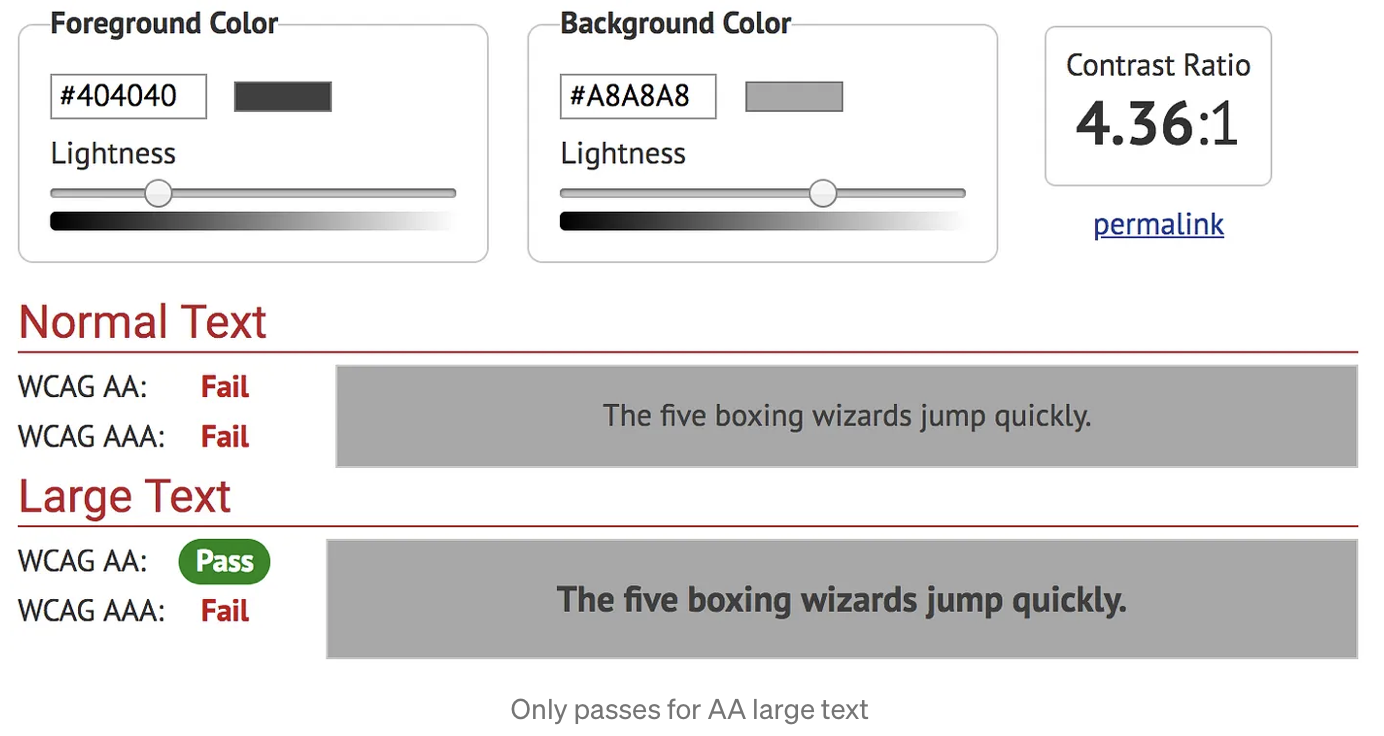
Contrast Checker — Free, online with grayscale

WCAG Contrast checker — Firefox addon

Color Contrast Analyzer — Chrome extension

WCAG 2.1 (Web Content Accessibility Guidelines)  The WCAG guidelines defines the following guidelines for accessible web content and associated contrast ratios.

1.4.3 Contrast (Minimum): The visual presentation of text and images of text has a contrast ratio of at least 4.5:1, except for the following: (Level AA)

Large Text: Large-scale text and images of large-scale text have a contrast ratio of at least 3:1;

Incidental: Text or images of text that are part of an inactive user interface component, that are pure decoration, that are not visible to anyone, or that are part of a picture that contains significant other visual content, have no contrast requirement.

Logotypes: Text that is part of a logo or brand name has no minimum contrast requirement.

1.4.6 Contrast (Enhanced): The visual presentation of text and images of text has a contrast ratio of at least 7:1, except for the following: (Level AAA)

Large Text: Large-scale text and images of large-scale text have a contrast ratio of at least 4.5:1;

Incidental: Text or images of text that are part of an inactive user interface component, that are pure decoration, that are not visible to anyone, or that are part of a picture that contains significant other visual content, have no contrast requirement.

Logotypes: Text that is part of a logo or brand name has no minimum contrast requirement.

Fall contrast Fall contrast Pass contrast
WCAG Typography contrast
Contrast can be controlled and fine-tuned in variable fonts with parametric axis that adjust thick strokes (XOPQ) and thin strokes (YOPQ) independently. Typography plays a major role in user experience, so it is must be visually appealing also being accessible and easy to read.
WCAG Level AAA requires a contrast ratio of at least 7:1 for normal text and 4.5:1 for large text. Large text is defined as 14 point (typically 18.66px) and bold or larger, or 18 point (typically 24px) or larger.
WCAG 2.1 requires a contrast ratio of at least 3:1 for graphics and user interface components (such as form input borders).
WCAG 2.0 level AA requires a contrast ratio of at least 4.5:1 for normal text and 3:1 for large text.

Contrast is the difference between the thick and thin parts of a letterform’s stroke, and creates the angle of stress within a type design. Monolinear typefaces have low stroke contrast, unlike high-contrast faces. A typical trait of a typeface with varying optical sizes is that display sizes have higher contrast than bodysizes.

  1. Plan Heading Structure Early. Ensure all content and design fits into a logical heading structure.
  2. Ensure Logical Reading Order. The reading order for screen reader users should align with the visual order.
  3. Provide Good Contrast. Be especially careful with shades of orange, yellow, and light gray. Check your contrast levels with our color contrast checker.
  4. Use True Text Instead of Images of Text. True text enlarges better, loads faster, and is easier to translate and customize.
  5. Use Adequate Font Size. Small text is difficult for all users to see. Ensure text is optimally readable.
  6. Remember Line Length. Don’t make lines too long or too short.
  7. Make Sure Links are Recognizable. Distinguish links from body text using more than just color (e.g., underline).
  8. Design Keyboard Focus Indicators. When navigating with the keyboard, the focused item must be visually distinctive.
  9. Design a “Skip to Main Content” Link. A keyboard accessible link for users to skip navigation should be at the top of the page.
  10. Ensure Link Text Makes Sense on Its Own. Avoid “Click Here” or other ambiguous link text such as “More” or “Continue”.
  11. Design Usable Widgets and Controls. Dialogs, tooltips, menus, carousels, etc. must be easy to use and accessible.
  12. Use Animation, Video, and Audio Carefully. Provide play/pause buttons. Avoid distracting movement.
  13. Don’t Convey Content Using Only Color. Users may override or may not be able to see differences between colors.
  14. Design Accessible Form Controls. Ensure form controls have descriptive labels, instructions, and error messages.
Contrast Checker API Tools here ->
Contrast refers to the difference between thick and thin parts of a letterform's stroke, creating the angle of stress in a type design. Monolinear typefaces have low stroke contrast, while high-contrast faces do not. Varying optical sizes are characterized by higher contrast in display sizes compared to body sizes.
Method of using a grid concept to lay out content, providing a mechanism for authors to divide available space for layout into columns and rows using a set of predictable sizing behaviors.

Components

Components are interactive building blocks for creating a user interface. They can be organized into categories based on their purpose: Action, containment, communication, navigation, selection, and text input.
Action
Action components achieve an aim
Containment components
Containment components hold information and actions – including other components like buttons, menus, or chips.
👉A dropdown is a graphical user interface element that allows users to choose one value from a list of options by clicking on a downward-facing arrow.
👉Date pickers can display past, present, or future dates Three types: docked, modal, modal input Clearly indicate important dates, such as current and selected days
👉 Inputs refer to the various resources or data that are used as an input to a system, process or algorithm in order to produce an output or result.
👉A tooltip is a graphical element in a user interface that displays additional information about a particular item when the user hovers or clicks on it with a cursor.
👉A checkbox is a graphical user interface element that allows the user to select one or multiple options from a list.
👉 A checkbox is a graphical user interface element that allows the user to select one or multiple options from a list.
Navigation elements
Navigation components help people move through the UI.
Selection
Selection components let people specify choices.

Order

Important to think about million details and helps user to do order faster

MAIN PAGE

This is visit card for business it must to be interesting and tell users all about site. 

Info PAGEs

It group of page  as important part of site such as main page becouse tell user about serious products of your company. This group pages to be the first functional, tell of the detail and  inform user.

Pages: Catalog, History company, Partners, Dillers, Contacts, Media page

For New Clients

Franchisee training programs and a presentation site providing complete information on support services with a description of cases on how to become a franchisee.

USER Profile

Complaints

Courses and seminars

e-Design Catalog

Used Minimalism and classic methods 

Banners and Herros

Of course, needs to be central part in the site life. It is more beautiful block of all blocks. Some special idea is used map with partner markers on it. 

Sample Wall in Vitebsk office